About this project
While attending Noble Desktop’s Graphic Design program in New York City, I completed this project as a class assignment. The assignment was to choose a brand with a physical product and re-brand it. This project includes creating a styleboard, deciding on a new color scheme, choosing a font, re-designing the logo and creating mockups.
I chose Four Peaks Brewery’s Kilt Lifter Scottish Ale as my product for this project.
About
Kilt Lifter
Kilt Lifter is Four Peaks Brewing Company’s award-winning flagship brew, crafted in the tradition and honor of the great strong ales of Scotland. Take one sip and you’ll swear it had been brewed by men in kilts—and maybe it was. 1
While Kilt Lifter is the star of Four Peaks’ brews, it has not received a refresh of its image in several years.
Challenge:
Find a way to give Kilt Lifter a bright new logo with a more modern feel, while still honoring its ties to Scotland and the Four Peaks brand.
Find a way to give Kilt Lifter a bright new logo with a more modern feel, while still honoring its ties to Scotland and the Four Peaks brand.
The design process
Throughout the design process I had two main focuses:
1. Keep our target market in mind
2. Maintain the Scottish style branding
The logo process
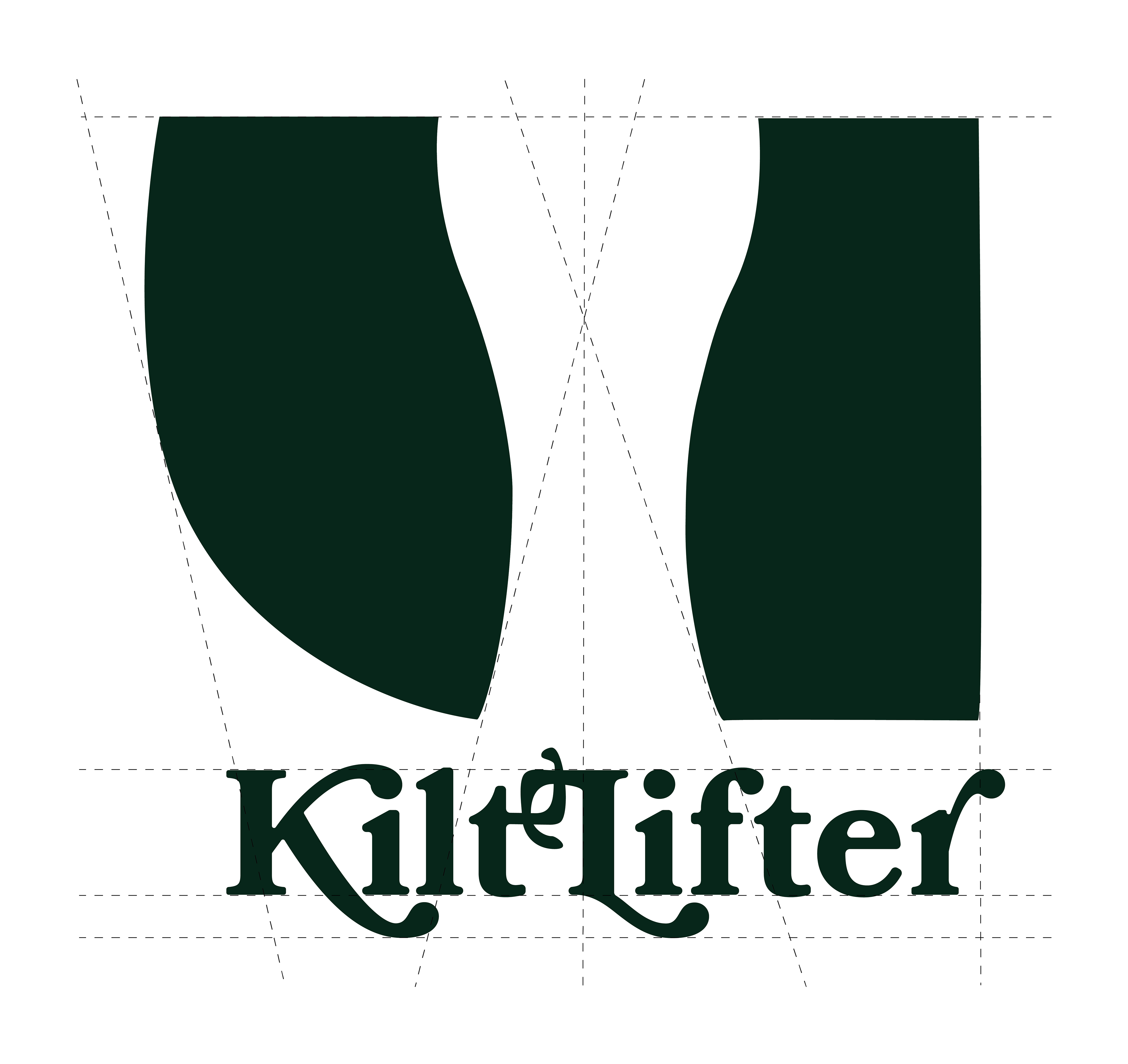
In thinking about the shape the logo would take on, I knew it was important to the client to keep the image of the kilt as a primary element. I began to consider how I could link the kilt with beer so anyone who saw this new logo would know right away that it is a beer brand.
In order to create a logo that would be naturally aesthetically pleasing, I started by using golden ratio circles to build the curve that would represent the lifted side of the kilt.
With the kilt shape completed, I got to work creating a pint glass using negative space inside the kilt. I continued to use the golden ratio circles to find the most visually appealing curves for my glass.Once I had the shape of the logo, I began working on how I could add the product name to the shape in the most visually appealing way.

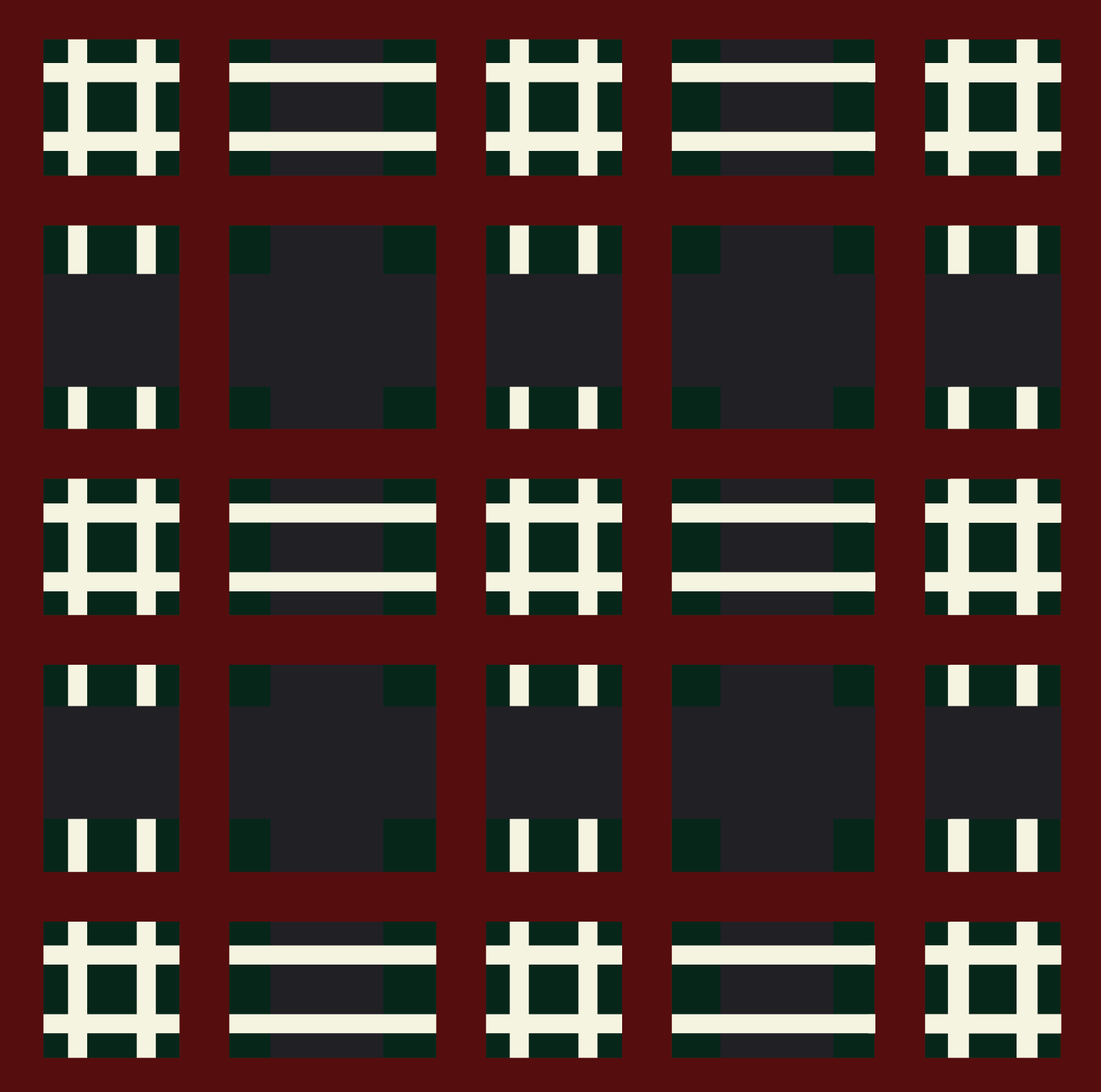
With the basic logo shape and the text complete, it was time to create the pattern that would fill the logo and be utilized across the branding of the product.
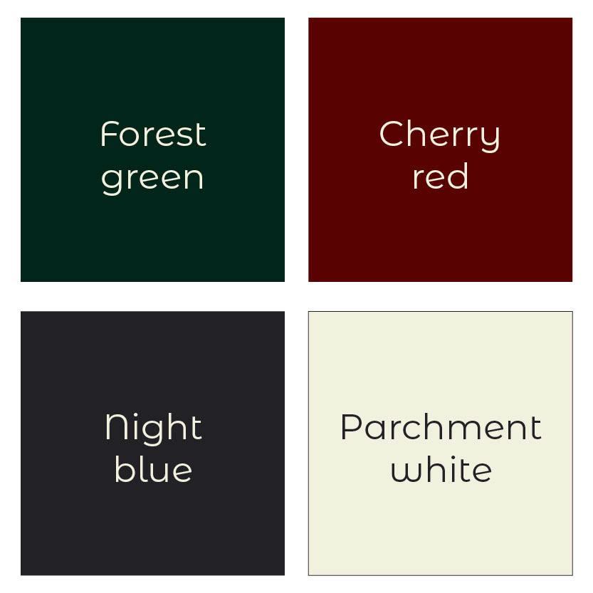
I referred to the national kilt of Scotland and the colors identified in the stylescape to create a custom pattern.
The final logo design:
The logo design guides
These are the brand guides for how this logo can be used for best results. The brand guides outline the 4 colors used in the primary logo and several variations of the logo that can be used in different circumstances.
The mockups
This is what you will see next time you reach for an ice cold Kilt Lifter.
For this can design I used the forest green color identified in the stylescape to fill 2/3rds of the can. The top 1/3rd features the plaid pattern I created to resemble the National Kilt of Scotland. Because the plaid consumes a large portion of the can, I opted for the simplified silhouette logo design in the parchment color.
Above: This alternative can design features a very sleek can with the parchment colored background and forest green stripes at the top and bottom. The primary Kilt Lifter logo is predominantly displayed as the focal point.
Right: These are the new Kilt Lifter coasters. They will be enjoyed far and wide by all who drink Kilt Lifter in any Four Peaks location.
Ad design
This is a mockup of what the ads will look like when you proudly see them all over town. This style of ad will allow for more creativity in advertising while staying in the guidelines of what this mockup displays. All variations can utilize the cardboard texture background, Bookmania typeface, watermarked Four Peaks Kilt Lifter logo and one of the two can designs. However, they can vary with different layouts and witty slogans.
Like what you see?
